15 famous logos we love (+5 we don't)
From the iconic Nike swoosh to the famous bitten Apple, logos are often the first thing we visualize when we think of a brand.
A good logo is a powerful visual embodiment of a brand’s identity, personality, and essence. Whether through bold colors or clever design, a well-designed logo becomes an instantly recognizable symbol that sets a brand apart from competitors. Sometimes it even makes an impact so strong that its shape and colors become synonymous with the brand itself. (Can you look at red and yellow together without thinking of McDonald’s?)
You can see why designing a great logo is an essential, and potentially scary, step in the process of building a brand. There are so many successful logos out there that designing one that stands out among the rest can prove difficult. The hit show “Silicon Valley” even dedicated an entire episode to this challenge, in which one of the characters protests using lowercase letters in their logo. “Every f***** company in the Valley has lowercase letters. Why? Because it’s safe. But we aren’t going to do that,” he says.
Lowercase or not, here is a list of famous logos we love (and others we don’t love so much) to inspire your own logo design process!
Logos we love
Apple
The beauty of the world-renowned Apple logo lies in its simplicity. Its minimalism reflects the clean, sleek design of the products it represents, and its shape effortlessly conveys the brand’s identity without needing to be accompanied by the company’s name. The simultaneous boldness and subtlety of the logo capture the essence of what the brand stands for — the idea that “simplicity is the ultimate sophistication.” The bitten apple continues to be one of the most prominent and easily recognizable logos in the world today.
Twitter’s minimalist design involves simple lowercase letters, a blue and white contrast, and an icon of a little bird that symbolizes the company name. While it’s true that the two-color, lowercase-letter formula has now become a logo cliché, it still works for Twitter, because the bird makes the logo unique and recognizable. According to the designer, the logo represents “freedom, hope, and limitless possibility.”
Disney
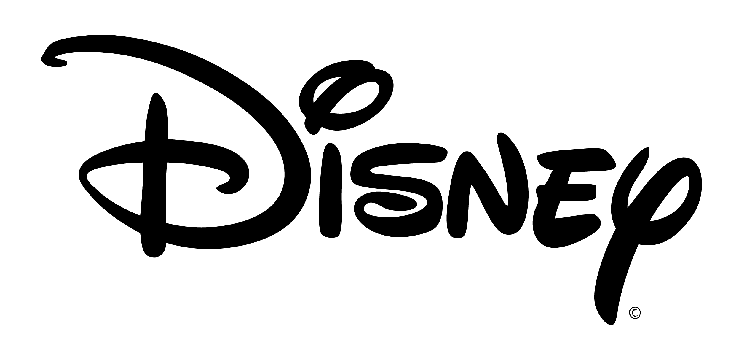
Disney’s logo embodies the magic of the Disney universe. Its iconic typeface, said to be inspired by Walt Disney’s signature, represents wonder, excitement, and boundless imagination. This at once piques the interest of a very young audience, while also evoking a sense of nostalgia in adults. The font’s unique design also distinguishes it from all other brands — no one else can use that font without looking like they are copying Disney.
Fedex
The Fedex logo doesn’t look like much, but a cleverly hidden symbol makes it special. It uses negative space between the E and the x to form an arrow, something you can’t unsee once you see it. The hidden design and distinct colors make an otherwise plain logo stand out.
Nike

The swoosh is so powerful, it makes a statement without using any words at all. When combined with Nike’s slogan, “Just do it,” it’s unstoppable. The message matches perfectly with the feeling of action and empowerment the swoosh evokes — which also shows us the importance of building a consistent brand image.
Target
Target’s bright red bullseye is one of the most recognizable brand logos of all time. In fact, 96 percent of American shoppers know what the symbol represents, according to a Target study. Its success lies in its simplicity, because the logo tells a story and fits the name of the brand while also being so easy to visualize.
Chanel
The Chanel logo is simply a stylized version of founder Coco Chanel’s initials. The bold interlocking Cs have come to represent what the brand is all about — wealth, luxury, and elegance — making for a truly impactful logo.
Beats by Dre
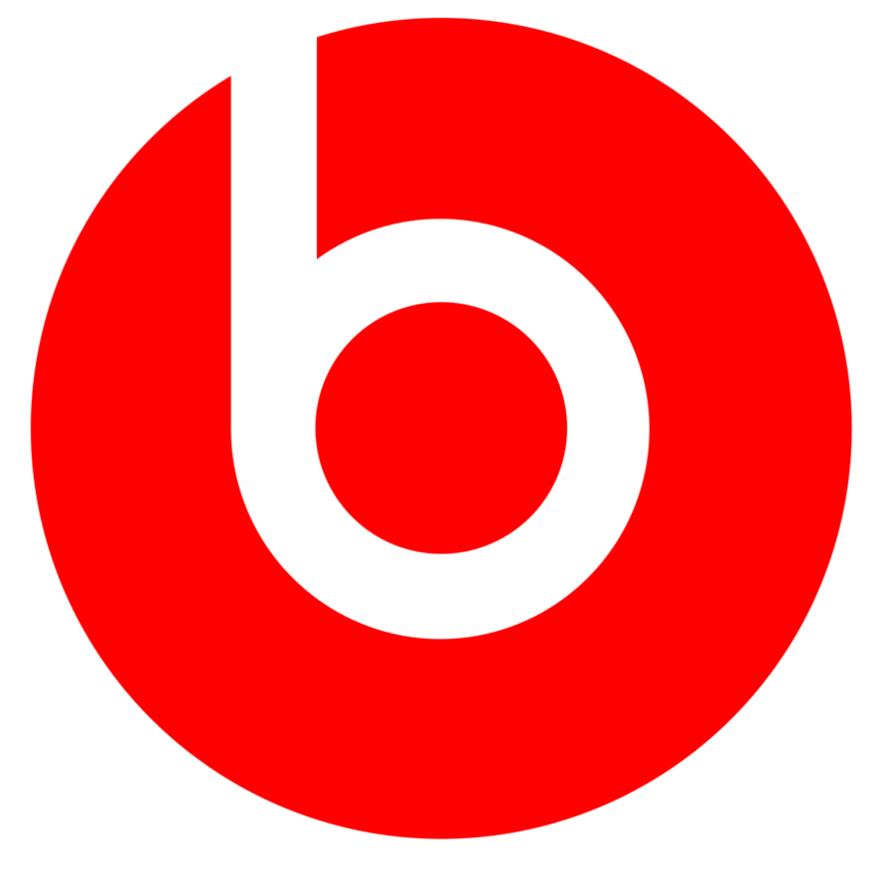
Beats by Dre has one of the coolest logos in the game. The symbol reflects the swanky, hip personality of the brand while also serving a double purpose. The design forms a “b” to showcase the brand’s name, but if you look more closely, it also looks like a human head wearing headphones. We think that’s pretty awesome.
The New York Times
The NYT’s classic logo design is in the typeface of old newspaper typography and reminds us of the organization’s distinguished legacy. It represents wisdom, truth, and sophistication. The condensation to just the “T” retains those elements while also giving off a modern twist and showcasing the brand's evolution in the digital age.
Glossier
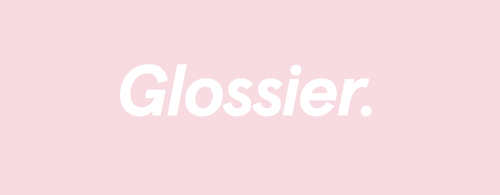
The Glossier logo’s simple sans-serif lettering and light-pink background fit the popular beauty brand’s youthful aesthetic and the “skin first, makeup second” message it promotes. The logo matches perfectly with their minimalist packaging style as well as the voice and tone of their blog, “Into the Gloss.”
Soundcloud
Soundcloud’s distinctive orange logo consists of half sound waves and half cloud, just like its name. Having the brand name written underneath the symbol adds to its visual descriptiveness and makes the logo highly aesthetically pleasing.
Adult Swim

Adult Swim has been pretty dormant in public consciousness ever since streaming services like Netflix challenged the predominance of cable TV. However, the Adult Swim logo recently blew up as a TikTok trend, with people posting clips that end with the [ AS ] logo being revealed in increasingly clever ways. This trend is a lesson in how brands can carry immense nostalgic value, and how the logo can become a beacon that draws fans back to the brand. This is why it’s important to consider your brand’s legacy when designing a logo. Who knows what random turn of events might once again catapult your brand into the spotlight, years down the line?
@hadi_sr Another one ##adultswim ##vano3000 ##math ##fyp ##foryou
♬ VANO 3000 - VANO 3000
@jayfitzman Get out there and press some buttons ##adultswim ##adultswimbump ##oscillotok @adultswim
♬ VANO 3000 - VANO 3000
Tinder
The electric orange-pink hues of the tinder logo make an already attractive symbol even more so. The silhouette of the flame represents the spark that Tinder can create between people who use their platform. This logo is a great example of picking logo colors that match the mood and tone of the brand!
Airbnb
Airbnb’s logo combines the different elements that make them who they are — people, places, and love — into an A. How cute!
Air
Last but not least, Air’s logo is definitely one of our favorites. The playful, artistic typeface and bright turquoise color show off what our brand is all about — a visual platform for creatives built by creatives. Read all about our logo’s design story here.
Logos we don’t love
Kumon
Kumon’s logo isn’t one that evokes a lot of joy in the viewer. Why does the kid in the logo look so upset? Kumon is adamant that it’s a “thinking face,” but folks on the internet seem to think otherwise, arguing that it looks more like the face of “existential despair.”
IHOP
IHOP recently revamped their original logo to “turn the frown upside down.” However, the new logo doesn’t look too friendly — people on social media have pointed out that if it’s supposed to represent a face, then the “p” looks like a tear. Combined with the uncannily wide, bright-red smile, the logo looks eerily clownish.
Juicy Couture
Juicy Couture reigned supreme in the early 2000s, but the fashion brand’s popularity has since dipped. Perhaps the New York Times-esque font has something to do with it. While the bedazzled font worked for them at the height of their popularity, it hasn’t evolved with the times and isn’t versatile enough to fit with today’s fashion trends.
Shiseido
The Shiseido logo doesn’t fit the vibe of the beauty products it’s selling. It looks like it could be a better fit for a hardware brand than a makeup brand. Might be time for a logo redesign!
NYC Taxi
The NYC Taxi logo has long been criticized for its awkward design. We can excuse the unattractive yellow color because they didn’t have much of a choice in the matter — all medallion cabs have been required by law to be painted yellow since 1970. However, the strange mismatching of fonts isn’t pleasing to the eye, and definitely something that needs a graphic design upgrade.
Simplify your logo design process with Air
All of our favorite famous logos are iconic in their own way, with distinct elements contributing to their unique appeal. The New York Times logo could not be more different from Nike’s, but they are both successful, because their individual strengths best reflect the identity of their particular brand. Whether the element that makes your logo stand out is its boldness, its simplicity, or its cleverness, it’s important that it embodies your brand’s personality.
This is where consistency in branding plays an important role. To build a winning brand, each branding element, in addition to the logo, needs to match the mood, feel, and voice of your brand. But when your visual assets are scattered across different platforms and workspaces, it can get difficult to keep track of them all.
Don’t let a clunky workflow get in the way of building a solid brand identity. With Air, you can manage all your creative assets in one place. Store, share, and collaborate on iterations of all your designs. Get feedback quickly, and share new versions of your work smoothly.
Air is where the creative process happens. Take control of yours today. Build a brand that nobody can forget.