What is the story behind Air's branding?
Britt Cobb is an Associate Partner at Pentagram Design. Over the last decade, he's worked on everything from the signage and way-finding on Governors Island to Justin Timberlake's coffee-table book. This range in clientele and variation of work is what Britt enjoys most about his job.
When Air underwent a brand refresh at the end of 2019, we called on Cody Min of Astronaut Monastery and Britt Cobb for assistance. Their work was imperative to Air's growth and continues to influence how we approach our brand today. This week, we spoke with Britt about the visual identity process, as well as his design philosophies at large.
How do you approach a brand refresh? Since you weren't creating Air's brand from scratch, where did our existing materials fit into the redesign process?
Well, I could tell almost immediately that there were certain elements of the old branding that your team was particularly attached to. You had a different script logo then, which Shane (CEO, Air) gravitated towards because its fluidity felt representative of the creative process—thoughtful yet imperfect. It was hand-written and human, which we loved, but we all agreed it could use some refinement. I'm glad we still chose to explore other directions though, because seeing other styles only helped reaffirm those strong feelings about the script logo.
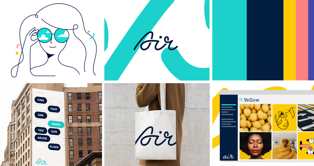
After seeing these alternative designs, the team decided to move forward with the updated script typeface. We took time to pinpoint the elements that were working and then elevated it. While there's a flavor of the old logo that's still in what you're doing now, the new design gave me more room to create complementary graphic elements that could be used more broadly.
It was also important to me that the logo, the typeface, and the product have some overlap and rationale. For example, the logo's rounded edges plays into the shapes of UI elements in the product. I love it when you can make those subtle details connect.
You provided us with all sorts of visual assets to work with. Does every brand need each of those elements nowadays?
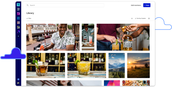
Air is a special case. Because your product is all about images and videos and graphics, we had a unique opportunity to go beyond just a logo, a typeface, and a color palette. We could establish a photography style, create a graphic motif, etc. Plus, having that range of assets allows your prospective customers to conceptualize what your product is and how it works.
I think clients ask for more than what they need sometimes because it's what they think visual identities come with, but it's not always necessary.
Can you talk a bit about how graphics played into Air's identity work, specifically how you created a graphic motif in addition to an illustration style?
Let me start with the illustration part. First off, I think digital product companies have come to over-rely on illustrations as a primary graphic tool. I get it, it's hard to visualize a digital product in a way that isn't too interface-y or technical, so it's easier just to draw someone having a good time at their laptop. For Air, we tried to create a unique style that combines illustrations with photography. It's a nice mix that's playful but also grounded.
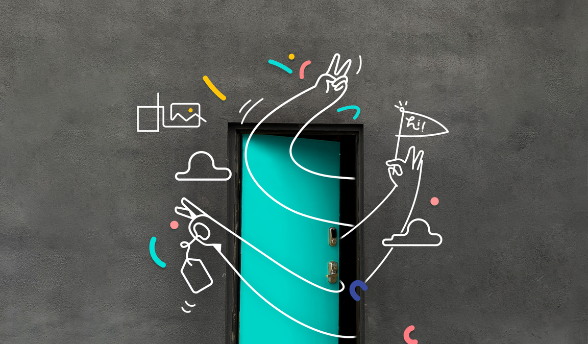
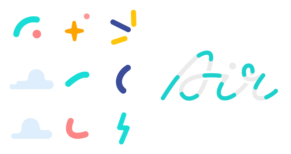
In terms of the graphic motif, that was extracted from the DNA of the logo itself. The macaroni-looking shapes are so simple, but there's an infinite number of ways you can use them and combine them to represent abstract ideas. Which in some way is what you hope the product you've created allows people to feel, right? Limitless in their ability to move things around and manipulate them.
Obviously most projects have some sort of deadline, but how else do you determine that a project is complete? It seems like it could be hard to stop fixing and tweaking.
Knowing when you're done is a funny thing because, for me, it's usually client-based work. A project is done when they say "we love this option!" Maybe I'm too much of a people-pleaser but I'll work endlessly to get to that point. It's easy for designers to feel like they have all the answers and everyone should just stand back, but a client's perspective is what really shapes a project and brings it to life.
That being said, it’s hard in the early stages of your career to take criticism. It takes a long time to learn to remove your ego and really value everyone's feedback. You have to be a good listener and interpret what your client is saying as well as what they’re not saying.
Along those lines, how do you encourage non-designers to provide feedback, especially when they might not have the vocabulary to articulate their thoughts?
Great question! I try not to make the design process feel stuffy or high-brow. I level the playing field by not getting overly technical about anything. I’ve found that this not only improves the working relationship with the client, but the final product winds up looking better, too! It's not like I'm doing surgery on them, I need their feedback just as much as they need my assistance.
Many of your clients are ever-growing, ever-changing businesses. How do you accommodate for that in your design process?
Well, no matter how perfectly suited an idea is in the moment, or how strongly you believe it will withstand the test of time, growth and change are inevitable. The best visual identities are the ones that can morph and adapt over the course of a business's lifespan. I've found that the simpler the assets I provide, the easier it is for other designers to stay within that world and evolve it over time.