5 bold branding fonts to inspire your next project
What does your brand font say about your business?
Just like your logo and color palette, the different fonts you choose for your business or your clients can have a huge impact on the way each brand is perceived. When you choose branding fonts that align with your business values and voice, your marketing is more likely to bring in your dream customers.
Finding the right typeface that aligns with your brand identity is no easy task! That's why we've put together a list of our favorite branding fonts from famous brand logos and what they say about the brands that use them.
This article is part of Air’s Ultimate Guide to Branding. Click here to explore the rest!
1. Helvetica
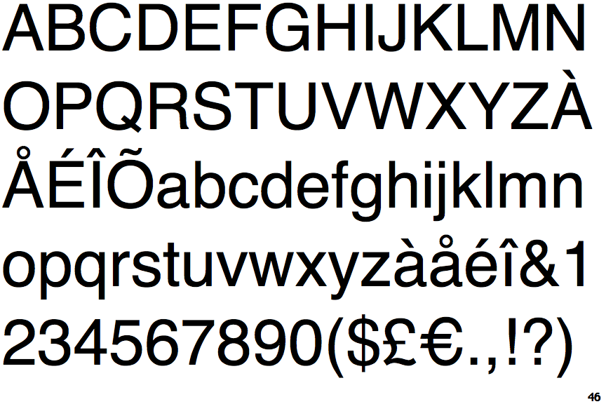
Helvetica is a sans-serif font created in 1957 by Swiss designers Max Miedinger and Edouard Hoffman. It has stood the test of time, quickly becoming the most popular typeface in the world. The initial idea behind the font was to make it so simple and neutral that it allowed the words to speak for themselves.
Helvetica is an ideal font for brands that want a bold, clean, and modern look. This font isn't overly flashy or decorative. And for those without a wordmark or who want to use a unique font for their logo may still want to utilize Helvetica in body copy as it's easy to read.
It's such a versatile font that you can see it being used by big brands across the world from various industries. Brands like LG, Microsoft, Panasonic, American Apparel, Jeep, Harley-Davidson, The North Face, and Oral-B all use Helvetica in their logos.
Panasonic
Panasonic uses a version of Helvetica that's pretty close to standard typefaces. While Panasonic does add a little flavor to the brand using bright colors, the font is, for the most part, simple and understated. Its unobtrusive style allows the brand and its products to speak for themselves.
Harley-Davidson
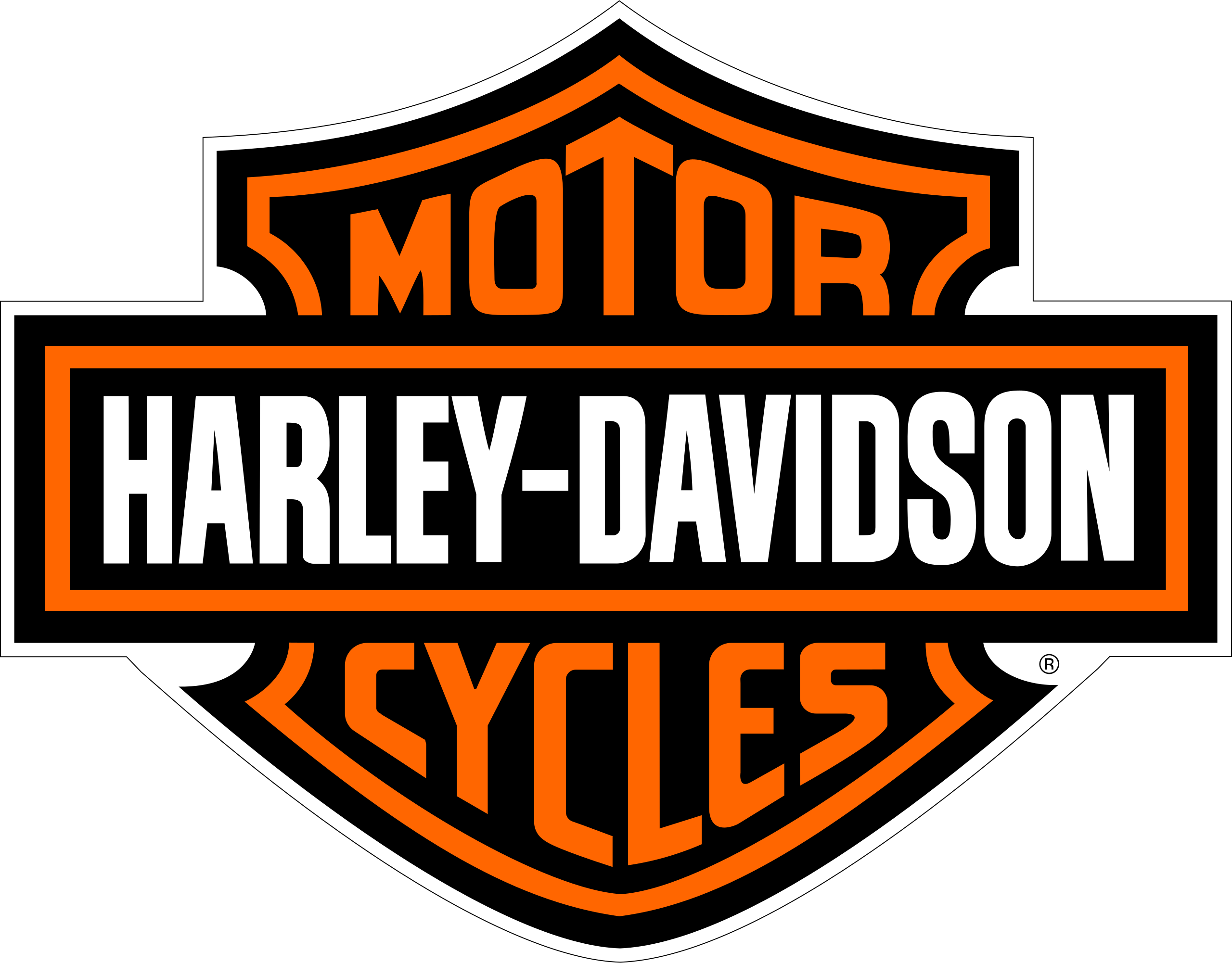
When you think of a rugged, masculine, American brand like Harley-Davidson, Swiss typeface may not be the first thing to spring to mind. While they have made many changes to the standard typeface, you can still see the basic shape of Helvetica Extra Compressed in the Harley-Davidson logo—taking the simple and understated and turning it up a notch.
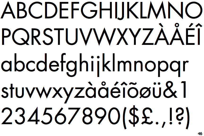
2. Proxima Nova
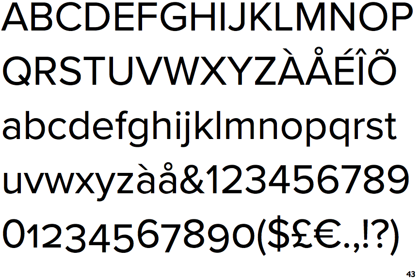
Proxima Nova is a sans-serif font created by Mark Simonson in 2005. It combines modern proportions with a geometric appearance, making it ideal for brands that want a cool, modern aesthetic. (This explains why so many tech brands use this font in their wordmarks!)
Proxima Nova looks clean and feels high-end while still being extremely functional. It can be used to create a bold, modern look as well as a fun, personal feel. Much like Helvetica, it is a fairly neutral font—not too masculine, not too feminine, not too serious, not too silly.
Brands like BuzzFeed, Mashable, Wired, Mic, and even NBC News rely on Proxima Nova to communicate their brand's personality and values. It's often also used as a font for body copy due to its readability on mobile.
Wired

Wired incorporates Proxima Nova into its logo design, in the “W,” “R,” and “D.” The logo has a very simple, geometric appearance that is complemented by this font type. As a modern magazine focused on science, tech, culture, and business in the 21st century, this font allows the brand to feel modern and minimal, allowing the journalism to speak for itself.
Buzzfeed
Buzzfeed uses a take on Proxima Nova SemiBold for its logo. As a media company based in New York, BuzzFeed is a fun, hip, and modern brand with a younger audience. As a cool and fun yet understated font, Proxima Nova is a great pick for BuzzFeed's simple logo. Buzzfeed's logo (and its font) has remained the same since 2008, a testament to the timelessness of this bold, modern font.
3. Avant Garde Gothic
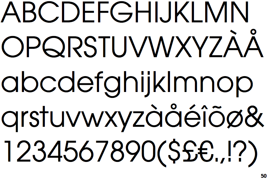
Designed by Herb Lubalin and Tom Carnase in 1970, ITC Avant Garde Gothic was based on the logo for Avant Garde Magazine, which Lubalin had created. This is a geometric sans serif font with its basic shapes built from circles and straight lines.
Strong and modern, Avant Garde Gothic has become a staple for the modern graphic designer. This font family works well for short texts and headlines, given that it has large, open counters and tall x-heights that provide a friendly feel.
Avant Garde Gothic certainly has a distinct, interesting look, making it ideal for innovative and creative brands. It can also have a retro feel that stands out in the crowd. When it comes to legibility, this font is not always the most readable with its tightly set kerning. For this reason, this font style is often used for headlines and short text. It also looks great in all caps, making it ideal for logos and signage.
Adidas
The Adidas logo features Avant Garde Gothic Demi typeface. As a sports brand, their visual identity is meant to be adventurous yet casual. (In fact, the relaxed nature of the brand is precisely why they made the brand name all lower case letters in the logo.) Adidas uses its logo to communicate its strong brand message (one of empowerment and triumph over challenges). So it's no surprise that they chose a strong, unique font. As the graphic in the Adidas logo has changed over time, its font has remained the same.
Yoplait
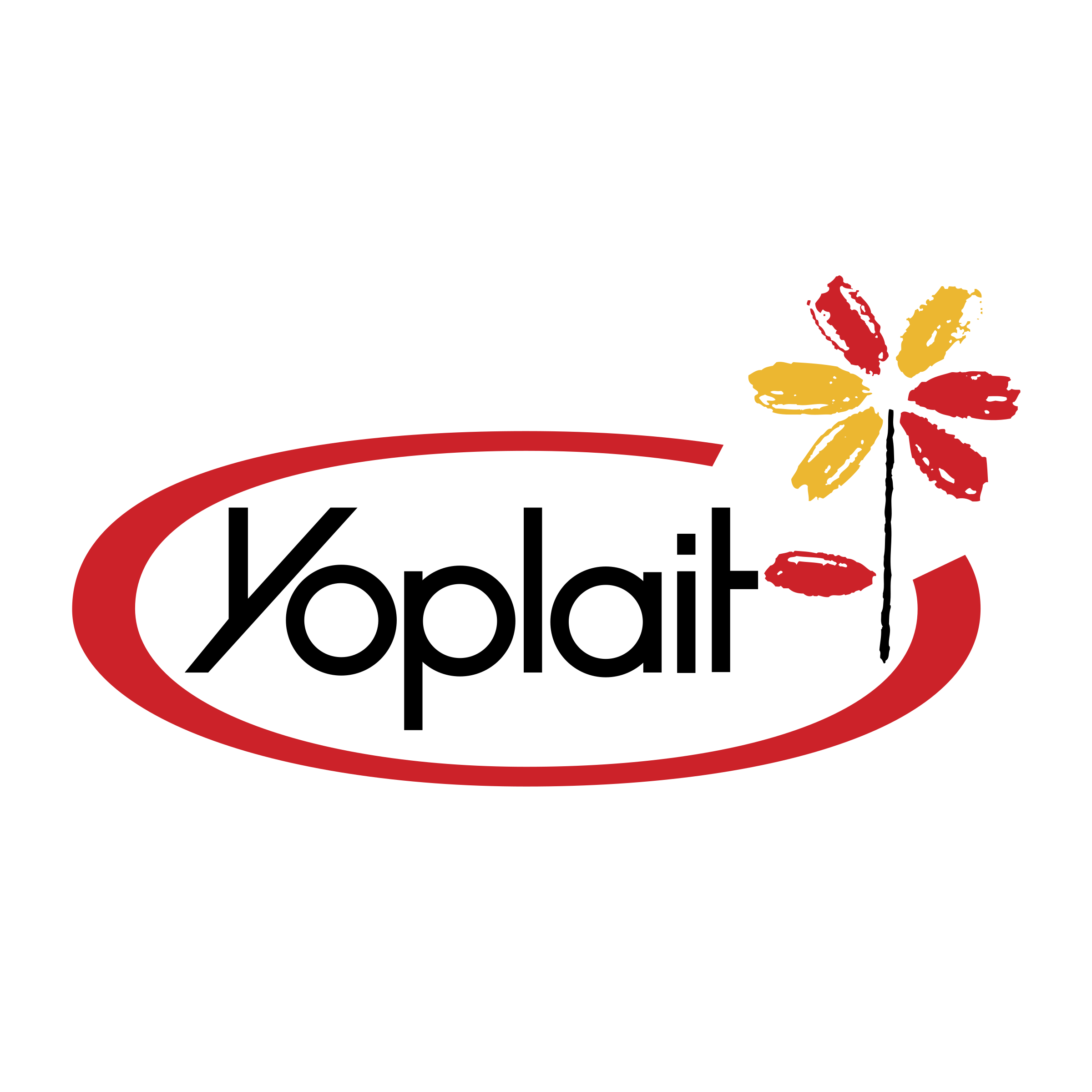
Yoplait uses Avant Garde Gothic DemiBold typeface in its logo. The logo has remained the same since the company's inception in 1965. This retro font harkens back to a time when food was simpler. It gives the logo a distinct look while showing that Yoplait has not changed in terms of its dedication to making great yogurt.
4. Futura
Futura is another geometric sans serif typeface. Designed by Paul Renner in 1927, this font is based on geometric shapes, common in the Bauhaus design style of the time. Renner went against that typical approach to sans serif font designs that were based on sign painting and condensed lettering, instead offering a modern take on the sans serif font that focused on function over form.
The Futura typeface is versatile with the ability to enhance the beauty of nearly any design. This typeface works well in both print and digital copy. The font is both retro and futuristic, making it a distinct and interesting option for both classic brands and those that are more hip and forward-thinking (as you'll see in the examples below!)
FedEx
The FedEx logo uses a combination of Futura Bold and Univers 67. Futura is a reliable and robust font, making it ideal for FedEx, a longstanding brand that values reliability and wants to be a business that people can depend on. This font also works well with the two colors used in the logo.
PayPal
Much like FedEx, PayPal also wants to be seen as solid and reliable given that they are processing payments and handling money. Unlike FedEx, the feel here is more futuristic than retro—a look created with the bold color combination and the rounding of the letters.
5. Garamond
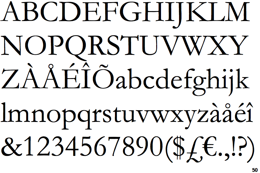
The only serif font on our list, Garamond, is also the oldest on this list. This family of fonts uses old-style serif designs from the mid-16th-century. Developed by Claude Garamond in France, this font style has influenced the majority of European typography.
Characterized by small serifs, moderate contrast, and rounded shapes, Garamond is often seen in magazine and newspaper print. It's also been used by several brands over time, including Apple, American Eagle, Abercombie & Fitch, Neutrogena, and even Rolex.
This font is perfect for brands that are not interested in chasing the latest trends but rather creating a refined and elegant aesthetic that stands the test of time. It can elevate more affordable brands while reinforcing the luxury of more expensive brands.
Rolex
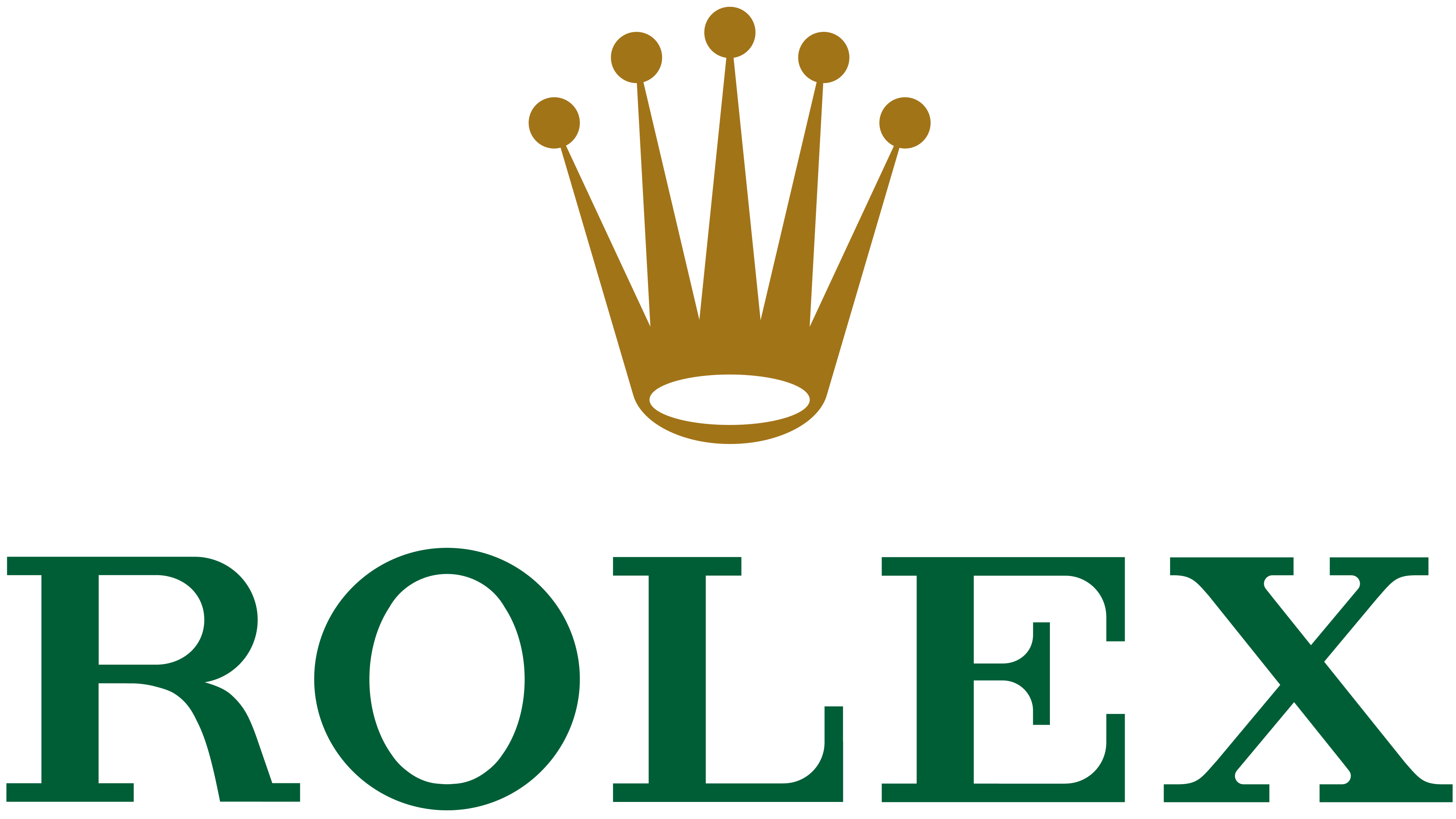
Rolex is a well-known, high-end watch brand that uses Garamond in its logo. The font reinforces the elegance of the brand, offering a refined look to the logo. It complements the graphic (crown) and colors (green and gold), which communicate extravagance and beauty.
Neutrogena
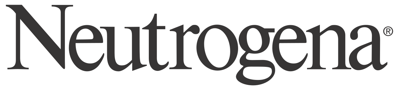
Neutrogena is an example of an affordable brand that uses Garamond to elevate its products. While the skincare company doesn't offer high-end specialty products, it is still a beauty brand that has to compete with so many others in the same price range. The use of Garamond in the Neutrogena logo makes it appear to be a premium offering while evoking the feeling of luxury, which is common in the beauty industry.
Bonus: Blitz Script
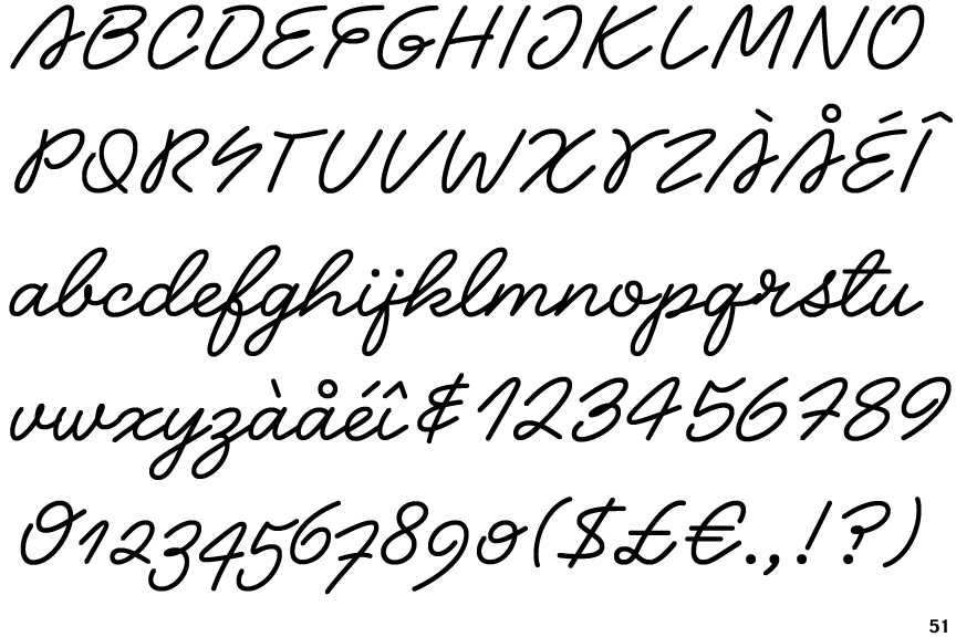
We couldn't make a list of our favorite fonts without including Blitz Script, the script font used in our wordmark. This decorative font offers an artistic, creative flair that works well for a brand that supports creatives in their work.
Blitz Script looks a lot like cursive handwriting or calligraphy lettering, giving it a unique, eye-catching quality. Fonts that appear handwritten also add a human touch that can communicate creativity, warmth, and even elegance.
Our wordmark is based on a customized drawing of the typeface Blitz script. This gives it an even more unique quality that aligns with the creative process we enable our customers to work through with our tools.
While there are many great fonts, you must choose one that aligns with your brand's values and personality. Use this list as branding inspiration for your next project, and add to it as you find new fonts you love.
Looking for more inspiration? Check out our All Brands on Deck branding guidelines database for more examples of the best typography, logos, and color palettes from brands you love.